
I’ve spent the last week or so creating a reference spreadsheet of colors for gymnastics teams based on their logos.

I started the sheet after trying to go through and select half a dozen slightly different colors of red and blue for the bar charts for my Rising to the Occasion post. Excel’s default colors don’t give a lot of options and the ‘regular red’ and ‘dark red’ (not their real names) were getting far too redundant so I decided to get technical and find the exact hex color for every team’s logo so that there can be some separation between teams.
I first started to notice an issue about halfway through the Pac-12, which was the first conference I created a chart for. It became increasingly obvious as I moved through the SEC and the B1G.
The issue? Teams suck at getting even moderately creative with their logo color choices.
This is the color family chart for the teams in the Power 5 football conferences (ACC, B1G, Big 12, Pac-12 and SEC). I included both primary and secondary colors for teams that have two non-neutral colors (so no black, white or gray):

Red makes up one-third of the colors used in P5 logos. Blue and yellow are both overrepresented, but not as much. More logos use various shades of tan/beige/light brown, which is an objectively boring color, than use purple and green, which are both awesome colors.
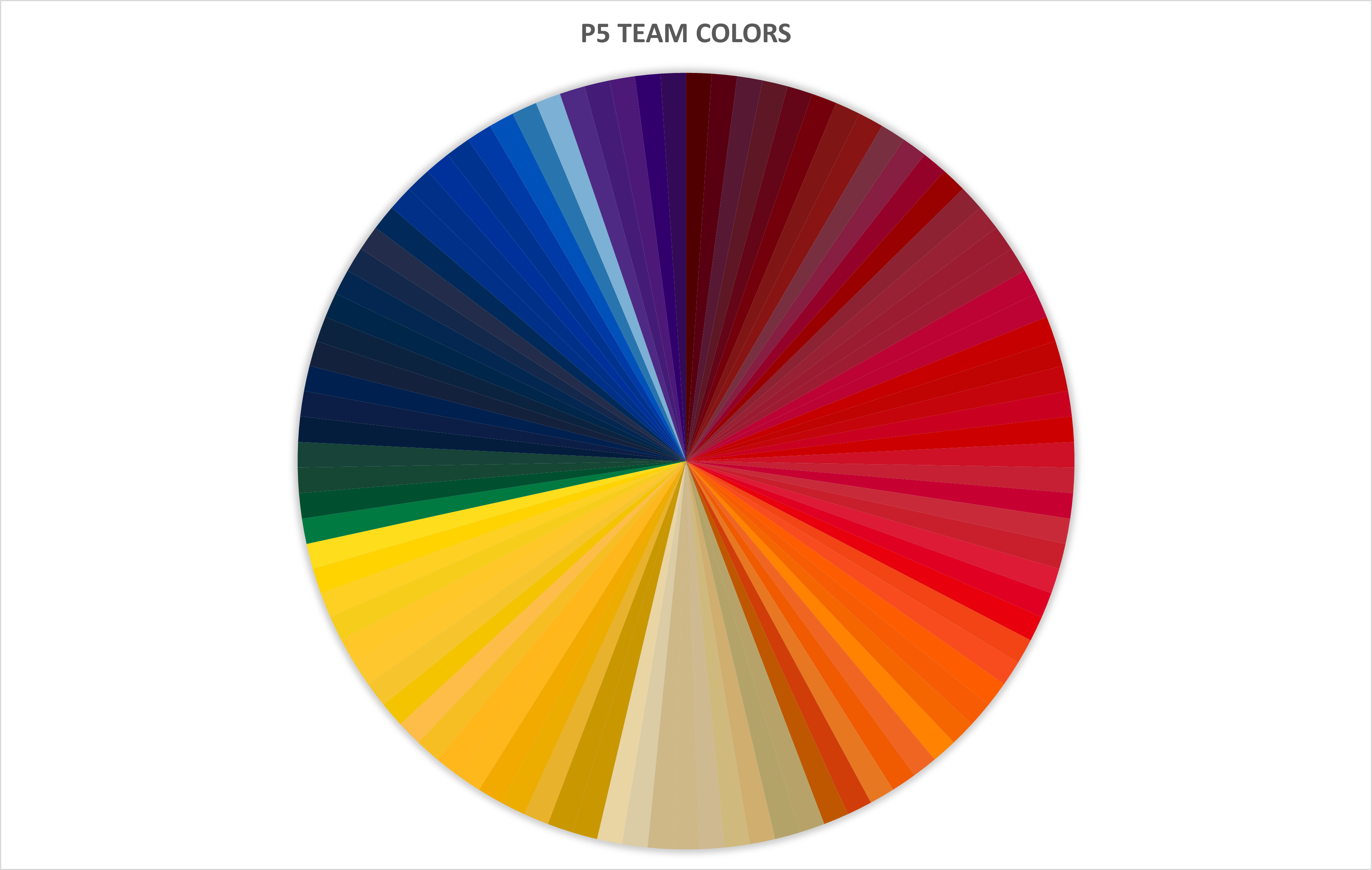
This is the color wheel of the 95 different non-neutral colors used in P5 logos:

Impressively, every team managed to find slightly different colors so each is still somehow “unique” while also being boring and uncreative.
Things get even worse when looking only at secondary colors:

Yeah, they were all yellow…
Chris Martin would be proud. Everyone else is bored.